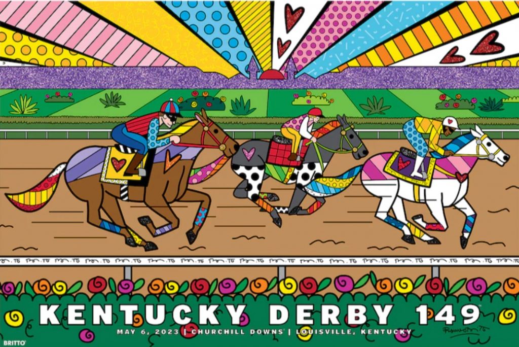
Romero Britto is world famous Brazilian/American artist who has sold millions of prints of his ‘pop art fused with cubism’ style paintings, designed postage stamps for the United Nations, and designed sets for the Super Bowl half time show.
This year he was commissioned to design the official artwork of the Kentucky Derby, to be used on posters, race books and all the official promotional material for the Run to the Roses, and here it is.
Now it looks to me like something the kids might paint in their final year of high school, but at the same time I really like it. It seems sort of happy and joyful and uplifting, which is exactly what the artist sets out to achieve.
I reckon it’s cool, much better than the idiotic design from last year that features a painting of a recipe for mint juleps that includes a pink drink made of bourbon which is brown, plus four mint leaves as an ingredient, and then a picture of 5, or maybe 6, leaves. Go figure that one out if you can.
Either way though fusing art with racing is a wonderful thing, for if they – behind your partner and kids if you have any – aren’t two of the greatest things in life, then I don’t know what are.
Perhaps PVL might have a think about picking up the idea of commissioning a famous artist to design something that the ATC can use as the promotional logo or picture for next year’s Everest. As well as being a focal point for the marketing of the race, it might also bring a whole new audience to racing, and – equally as importantly, be a whole new vehicle to engage the broader public and soften and celebrate the beauty of racing, instead of allowing the activists to hijack the perceptions of our sport with their own ugly imagery.
Just a thought. What do you reckon?
